
 How-to
How to Optimize Shopify Product Pages for Mobile Users
Table of Contents
- Why Mobile Product Pages Decide Whether Paid Traffic Converts
- Start With a High-Converting Shopify Product Page Structure
- Pick a Shopify Product Page Template Built for Mobile First
- Shopify Product Page Speed Optimization: Fix Page Weight Before Anything Else
- Optimizing Shopify Product Images for Mobile Screens
- Mobile CRO Testing, Accessibility, and Checkout Friction
- Put Your Mobile Product Pages to Work With NeuroAds
- Frequently Asked Questions
Last Updated: November 18, 2026
Why Mobile Product Pages Decide Whether Paid Traffic Converts
Your ad did its job. The click landed.
The reason is simple. A mobile product page is not a smaller desktop page.
Most stores treat mobile responsiveness as a checkbox. That's the mistake. Responsive design only means the layout fits.
Below, we'll walk through a step-by-step process: page structure, template choice, speed, images, and mobile CRO testing.
The core argument: mobile conversion is won before checkout.
Start With a High-Converting Shopify Product Page Structure
A high-converting Shopify product page answers three questions before the shopper scrolls: what is it, why should I care, and what do I do next. Structure decides whether those answers land in the first screen.
Above-the-Fold Elements That Earn the Scroll
Above the fold means everything a shopper sees before scrolling. On mobile, that's a small window. Spend it carefully.
- Product image first. A large, clear photo, not a carousel that hides the product.
- Price and title together. No hunting for cost.
- One primary CTA. A sticky Add to Cart beats a button buried below reviews.
What most guides miss is the order. Put the add-to-cart action within thumb reach, not at the top corner where one-handed users can't tap it.
Content Hierarchy for Small Screens
Content hierarchy is the ranked order of information on the page. On a phone, only one idea should lead each scroll segment.
- Lead with benefit, then spec.
- Break descriptions into short blocks, not walls of text.
- Put reviews and FAQs after the buy decision, not before it.
If you want a proven layout to copy, this conversion rate framework walks through a seven-step structure you can apply directly to your product template.
Pick a Shopify Product Page Template Built for Mobile First
Choose a Shopify product page template that was designed for small screens first, then scaled up. Mobile-first design means the phone layout is the starting point, not an afterthought.
Many themes still build desktop-first and squeeze down. The result is cramped tap targets and text that reflows badly. When you compare themes, check these before you commit:
- Tap targets sized for thumbs, not cursors.
- Sticky CTA support built in.
- Lazy loading for images on by default.
A common mistake is picking a theme for its homepage demo. Judge it on the product page on an actual phone, at actual screen resolution, on a slow connection.
Shopify Product Page Speed Optimization: Fix Page Weight Before Anything Else
Shopify product page speed optimization starts with page weight, the total size of everything the browser must download. Cut weight first. Every other speed fix is secondary.
Page load speed affects bounce rate and conversion rate at the same time, and it also feeds directly into how Google evaluates your product pages on mobile. Google's mobile-first indexing means the smartphone version of your page is the one it crawls, indexes, and ranks.
Here's the order we'd work in:
- Compress images and serve modern formats.
- Turn on lazy loading so off-screen media waits.
- Enable browser caching where your setup allows.
- Minify CSS and JavaScript.
- Audit every third-party app and remove what you don't use.
Connecting Speed to Mobile-First Indexing
The practical consequence of mobile-first indexing is that your desktop page can look fast while your mobile page fails the same metrics.
The fix is usually the same image compression work described in the images section, applied to the mobile breakpoint specifically.
Watch out: lazy loading the hero image is a classic own-goal. If the largest image above the fold is lazy-loaded, Largest Contentful Paint gets worse, not better.
Third-Party Apps and JavaScript Execution
Every app you install can add JavaScript that runs on the product page. Stack enough of them and JavaScript execution becomes the bottleneck, and on mid-range Android phones, which make up a large share of mobile shopping traffic, the penalty is far worse than on an iPhone or a desktop.
- List your installed apps.
- Check which ones load scripts on product pages.
- Remove or defer anything not earning its keep.
The thing nobody tells you about apps is that a review widget, a popup tool, and a currency converter can each add weight. Together they can double your page load time. Fewer apps, faster page.
Measuring Mobile Speed Properly
Don't trust a single lab score. Use three sources together:
- PageSpeed Insights for lab and field data, mobile tab only.
- Search Console Core Web Vitals report for real-user field data across your product URLs.
- A real mid-range Android phone on a throttled connection for the honest test. Chrome DevTools device emulation is a starting point, not the finish line.
Track the same three metrics over time, Largest Contentful Paint, Interaction to Next Paint, and Cumulative Layout Shift, and tie changes back to conversion rate. Speed work that doesn't move a metric or a conversion number is busywork.
Optimizing Shopify Product Images for Mobile Screens
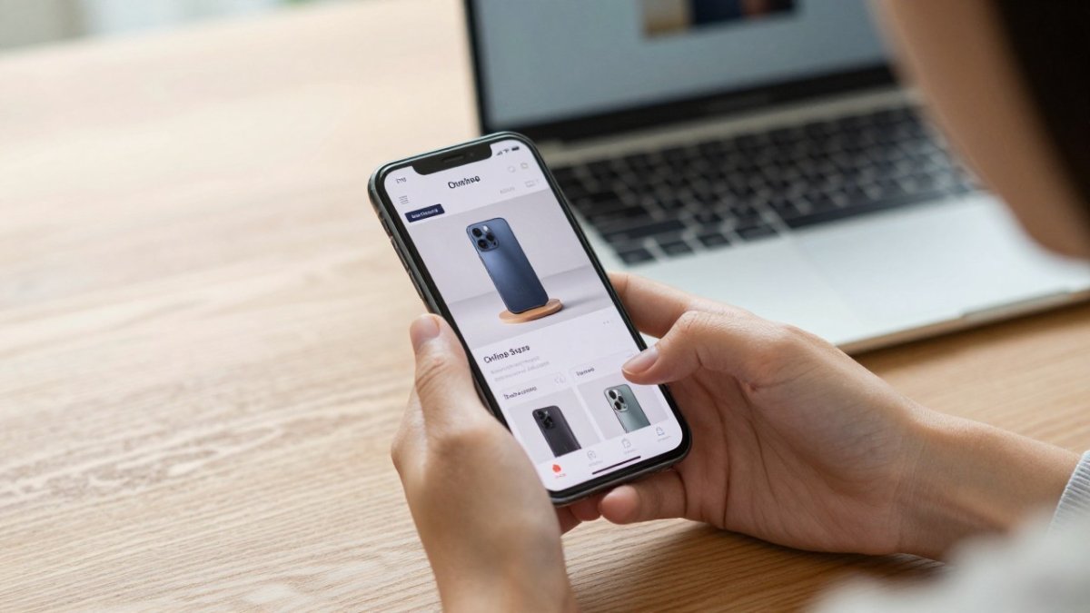
Optimizing Shopify product images for mobile means matching file size and format to a small screen. A photo shot for desktop is often far heavier than a phone needs.
The woman is American.
Practical steps:
- Compress every image before upload.
- Resize to the largest size the mobile layout actually displays.
- Use lazy loading so below-the-fold images wait.
Product imagery drives the buy decision. Blurry photos kill trust. Oversized photos kill speed. Aim for sharp and light.
Mobile CRO Testing, Accessibility, and Checkout Friction
Mobile CRO testing is the practice of running controlled changes on the mobile product page and measuring which version converts better. It's the step most stores skip, and it's where the gains hide. What separates a real testing program from guesswork is a framework: one variable per test, a sample size you commit to before launch, and a primary metric defined in advance.
A Mobile CRO Testing Framework You Can Run This Month
Most guides stop at "test your CTA." That's not a framework. Here's one that works on Shopify without a developer.
- Pick one element per test. Sticky add-to-cart vs. static, one hero image vs. a three-image gallery, short vs. long description. Changing two things at once tells you nothing.
- Define the primary metric before launch. Add-to-cart rate is the usual choice for product pages; revenue per session is better if your AOV varies widely. Decide which one wins and don't switch mid-test.
- Set a minimum runtime. A common pattern is two full business weeks, because weekday and weekend mobile traffic behave differently. Stopping a test on day three because one variant is ahead is the most common way stores fool themselves.
- Segment by device and traffic source. Mobile organic and mobile paid often respond differently to the same change. A sticky CTA that helps paid social shoppers can hurt organic shoppers who scroll deeper.
- Log every test, including losers. A test log prevents the same idea from being re-run six months later and gives you a pattern library for future templates.
Watch out: Shopify's native theme editor does not split traffic for you. You either install a testing app or duplicate the theme and route traffic manually, and if you route manually, make sure the variant assignment is sticky per visitor, or returning shoppers will see both versions and skew your data.
Accessibility (WCAG) for Mobile Shoppers
Accessibility is the gap almost every mobile product page guide skips, and it matters for two reasons: it's a real usability issue for shoppers with low vision, motor impairments, or one-handed use, and it's increasingly a legal and SEO factor. The Web Content Accessibility Guidelines (WCAG) published by the W3C are the reference standard most organizations cite.
The mobile product page failures that show up most often:
- Tap targets below 44 by 44 CSS pixels. Apple's Human Interface Guidelines and WCAG both point at roughly this size. Swatch selectors, quantity steppers, and close buttons on image zoom are the usual offenders.
- Low contrast text. Price, shipping estimates, and variant labels set in light gray on white fail WCAG AA contrast ratios and are unreadable in sunlight.
- Missing alt text on product images. Screen readers announce nothing, and you lose the image SEO benefit at the same time.
- Form fields without labels. Checkout and newsletter fields that rely on placeholder text only become unusable once the shopper starts typing.
A practical audit: turn on your phone's screen reader (VoiceOver on iOS, TalkBack on Android) and try to add a product to the cart. If you can't complete the purchase without sight, neither can a meaningful share of your shoppers.
Mobile-Specific Payment Gateways and Digital Wallets
Digital wallets are the highest-leverage checkout change on mobile, and they're the piece most product page guides ignore.
On Shopify, Shop Pay, Apple Pay, and Google Pay are enabled from the payment settings and surface as express checkout buttons. Two things to get right:
- Place express checkout above the form, not buried below it. The whole point is skipping the form.
- Test the wallet flow on a real device with a real card. Sandbox environments frequently behave differently from live wallets, and a broken Apple Pay button silently kills conversions.
Watch out: express checkout buttons can cannibalize your own upsells and post-purchase offers if those are wired to the standard checkout flow.
| Problem | Fix | Impact |
|---|---|---|
| Slow page load | Compress images, lazy load | Lower bounce rate |
| Tiny tap targets | Enlarge to 44x44 CSS pixels | Fewer mis-taps, WCAG compliance |
| Buried CTA | Sticky add-to-cart | More add-to-carts |
| Cluttered checkout | Enable Apple Pay, Google Pay, Shop Pay | Less checkout friction |
| No testing | Run one-variable mobile CRO tests | Higher conversion rate |
To see how testing turns clicks into sales, this guide on AI landing page testing shows the method in practice.
Put Your Mobile Product Pages to Work With NeuroAds
A fast, well-structured mobile product page is only half the system.
That's where NeuroAds Inc. fits. Our AI-powered ad optimization and predictive targeting help sharpen who sees your ads.
If you're weighing chatbot options, this breakdown of the best AI chatbot for Shopify stores covers product discovery, support, and conversion in one place. And if paid traffic is your focus, the AI advertising platform ties Google, Meta, and TikTok ads to Shopify revenue in one view.
Fix the structure, the speed, and the images on your mobile product pages, then put AI-driven ad optimization and the Shopify chatbot to work.
Explore the NeuroAds Inc. platform to see how it fits your store.
Frequently Asked Questions
How do I make my Shopify product pages mobile-friendly?
Start with a responsive theme and test it on real devices, not just the theme editor preview. Compress every product image, enable lazy loading, and cut unused third-party apps that add JavaScript. Keep tap targets at least 44 by 44 pixels so buttons are easy to hit with a thumb. Then simplify the layout: one clear product image gallery, a short benefit-led description, and a sticky add-to-cart button.
How can I improve Shopify product page speed on mobile?
Page weight is the main lever. Compress images to WebP, avoid oversized hero videos, and enable browser caching and minification through your theme settings. Audit your installed apps: each one that injects JavaScript into the product template slows first render, so remove anything not actively used. Run a mobile audit in PageSpeed Insights and watch Core Web Vitals, especially layout shift caused by late-loading banners or review widgets. Reserve space for those elements in the template so the page does not jump while loading.
What should a high-converting Shopify product page include?
A high-converting Shopify product page covers five things above the fold on mobile: a clear product image, the price, a short benefit statement, social proof such as ratings or review count, and an add-to-cart button that stays visible as the shopper scrolls. Below that, include shipping and return details, sizing or spec information, and objection-handling copy that answers the questions shoppers actually ask.
How do I test a Shopify product page on different mobile devices?
Use the Shopify mobile preview for a quick layout check, then move to real hardware. Test on at least one recent iPhone and one mid-range Android phone over a cellular connection, not office Wi-Fi, because that is how most mobile traffic arrives. Check tap targets, sticky CTA behavior, image cropping, and checkout flow on each. For conversion rate optimization, run A/B tests on one variable at a time, such as button placement or description length, and let each test run long enough to reach statistical significance before changing anything else.